
A slow-loading website isn’t just an inconvenience; it’s a conversion killer. Imagine this: a potential customer lands on your site, eager to explore your products or services, but instead of a seamless experience, they’re greeted by a spinning loading icon. Within moments, frustration sets in, and they hit the back button, never to return. Studies show that 53% of mobile users abandon a site if it takes longer than three seconds to load, and Google’s algorithms now prioritize speed as a critical ranking factor. Whether you’re a small business owner, a blogger, or an e-commerce giant, optimizing your website speed isn’t optional; it’s essential for survival.
But here’s the good news: you don’t need to be a tech genius to transform your site into a lightning-fast powerhouse. From compressing images to leveraging browser caching, the strategies we’ll cover in this guide are actionable, proven, and designed to deliver measurable results. By the end of this article, you’ll not only understand why website speed matters but also how to diagnose bottlenecks, implement fixes, and maintain peak performance. Ready to leave sluggish load times in the dust? Let’s dive in.
Why Website Speed Matters for User Experience and SEO
Website speed is far more than a technical metric; it’s the cornerstone of user satisfaction, engagement, and search engine visibility. When a page loads quickly, visitors are more likely to stay longer, explore multiple pages, and complete desired actions like making a purchase or filling out a contact form. Conversely, research by Google reveals that as page load time increases from 1 second to 5 seconds, the probability of a bounce skyrockets by 90%. This isn’t just about losing a single visitor; it’s about missed revenue opportunities, damaged brand credibility, and a downward spiral in organic traffic.
From an SEO perspective, speed is a direct ranking factor in Google’s Core Web Vitals, a set of metrics that evaluate user experience. Sites that score poorly on metrics like Largest Contentful Paint (LCP) or First Input Delay (FID) are often pushed down in search results, making it harder for potential customers to find you. Beyond rankings, slow sites also suffer from lower crawl efficiency, meaning search engines may index fewer of your pages, further reducing your visibility. Even social media platforms like Facebook and Twitter penalize slow-loading links by deprioritizing them in feeds, compounding the problem.
The ripple effects extend to mobile users, who now account for over 60% of global web traffic. Mobile networks are inherently less stable than desktop connections, making speed optimizations even more critical. A delay of just 100 milliseconds can drop conversion rates by 7%, and for e-commerce sites, this translates to thousands in lost sales. Beyond conversions, speed impacts ad revenue for publishers. Faster sites serve more ads, increasing impressions and click-through rates. In short, speed isn’t a luxury; it’s a non-negotiable competitive advantage that directly impacts your bottom line.
Key Factors That Affect Website Loading Times
The most critical factor influencing your website’s speed is server response time, which accounts for the delay between a user’s request and the server’s initial response. A slow server, whether due to inadequate hosting, unoptimized database queries, or excessive HTTP requests, can add seconds to your load time, frustrating users before they even see your content. For example, shared hosting plans often struggle under high traffic, while dedicated or cloud-based solutions like AWS or Google Cloud can handle spikes more efficiently. Other key factors include:
- Unoptimized images and media: High-resolution images, videos, and GIFs can bloat page size, forcing browsers to download unnecessary data. A single uncompressed 5MB image can increase load time by 2-3 seconds on mobile devices.
- Excessive third-party scripts: Analytics tools, chatbots, and social media widgets add functionality but also introduce render-blocking JavaScript, delaying page interactivity. Each script requires additional HTTP requests, slowing down the critical rendering path.
- Lack of caching mechanisms: Without browser or server-side caching, returning visitors must re-download static assets (like CSS and JavaScript files) on every visit, wasting bandwidth and time.
- Poorly structured code: Bloated HTML, inline CSS, and unminified JavaScript files increase file sizes and parsing time. Tools like Google Lighthouse often flag these issues as low-hanging fruit for optimization.
- Too many redirects: Each redirect (e.g., from HTTP to HTTPS or www to non-www) adds an extra round trip to the server, increasing latency. Chain redirects (e.g., Page A → Page B → Page C) compound this problem exponentially.
The cumulative effect of these factors can turn a snappy website into a sluggish one. For instance, a site with 100+ HTTP requests, uncompressed images, and no caching might take 10+ seconds to load, a death sentence for user retention. Addressing even a few of these issues can shave 30-50% off load times, making speed optimization a high-ROI investment.
Tools and Methods to Measure Website Speed Accurately
The gold standard for measuring website speed is Google PageSpeed Insights, a free tool that analyzes both mobile and desktop performance while providing actionable recommendations tied to Core Web Vitals. It assigns a score (0–100) based on real-world data from the Chrome User Experience Report (CrUX), making it invaluable for identifying field data issues like slow LCP or high CLS (Cumulative Layout Shift). Unlike lab-based tools, PageSpeed Insights reflects how actual users experience your site, which is critical for SEO and conversions. Other essential tools and methods include:
- Adsbot: Features a Page Speed Checker that specifically monitors the loading speed of your ad landing pages. It alerts you if pages are slow, helping you fix speed issues that could hurt your ad performance and Quality Score.
- GTmetrix: Combines Google Lighthouse with real-time monitoring to track load times, page size, and request counts. Its waterfall chart visualizes how each asset loads, helping pinpoint bottlenecks like slow third-party scripts.
- WebPageTest: Offers advanced testing from multiple global locations, simulating different connection speeds (e.g., 3G, 4G). Its filmstrip view shows how a page renders over time, revealing render-blocking resources.
- Pingdom: Focuses on uptime and response times, with alerts for downtime. Its performance grade breaks down issues like unoptimized images or excessive DOM elements.
- Chrome DevTools: Built into the Chrome browser, this tool lets developers audit performance in real time, including network throttling to simulate slow connections. The Performance tab records loading sequences to identify JavaScript or CSS blocking the main thread.
- Lighthouse CI: Automates performance testing in development pipelines, ensuring speed optimizations aren’t overlooked during updates. It’s ideal for teams using Agile or DevOps workflows.
While these tools provide invaluable data, consistency is key. Run tests at different times of day (to account for traffic spikes), from multiple locations (to assess CDN effectiveness), and on various devices (to catch mobile-specific issues). Remember, a single test is a snapshot trend analysis over weeks or months that reveals the true impact of your optimizations.
Optimizing Images and Media for Faster Load Times
Images and videos often account for over 50% of a webpage’s total weight, making them the biggest culprits behind slow load times. The first step to optimization is choosing the right file format: JPEG is ideal for photographs due to its compression efficiency, while PNG works best for graphics with transparency (like logos). For animations, WebP, a modern format supported by 95% of browsers, offers 30% smaller file sizes than JPEG or PNG without sacrificing quality. Tools like Squoosh or TinyPNG can convert and compress images in bulk, reducing file sizes by 60-80% with minimal quality loss.
Beyond formatting, lazy loading ensures images only load when they enter the viewport, prioritizing above-the-fold content. This technique, now natively supported in HTML (loading=”lazy”), can improve initial load times by 20-30%. For videos, avoid auto-playing content and use placeholder images with play buttons to defer loading. Hosting videos on platforms like YouTube or Vimeo (and embedding them) offloads bandwidth from your server while leveraging their optimized delivery networks.
Another critical tactic is responsive images, which serve appropriately sized versions based on the user’s device. Using the srcset attribute in HTML, you can specify multiple image sizes, ensuring mobile users don’t download desktop-sized assets.
This approach reduces unnecessary data transfer, especially for mobile users on metered connections. Finally, content delivery networks (CDNs) like Cloudflare or Imgix can dynamically optimize and cache images globally, reducing latency by serving assets from the nearest edge server.
How Mobile Optimization Influences Website Speed
Mobile optimization isn’t just about shrinking a desktop site to fit a smaller screen; it’s about rearchitecting the entire experience to account for slower processors, intermittent connectivity, and touch-based navigation. Google’s mobile-first indexing means the mobile version of your site is now the primary benchmark for rankings, making speed optimizations non-negotiable. For instance, a desktop site might load in 2 seconds, but the same site on a 3G connection could take 10+ seconds if not optimized, leading to 70% higher bounce rates compared to fast-loading competitors.
The biggest mobile-specific challenges include render-blocking resources like unoptimized JavaScript and CSS, which delay interactivity. Mobile devices also have limited CPU power, so complex animations or heavy frameworks (like React or Angular) can cause janky scrolling and slow responses. To combat this, defer non-critical JavaScript and use CSS containment to isolate styles. Tools like AMP (Accelerated Mobile Pages) strip down HTML to essentials, loading pages almost instantly, though they require trade-offs in functionality.
Another critical factor is touch targets: buttons and links must be at least 48×48 pixels to prevent accidental taps, which can frustrate users and increase dwell time. Mobile users also expect instant feedback, like a visual indicator when a button is pressed, so perceived performance is just as important as actual speed. Finally, offline capabilities via service workers (part of Progressive Web Apps) can cache key assets, ensuring users can still browse even with spotty connections. Given that mobile traffic now exceeds desktop globally, ignoring these optimizations means alienating the majority of your audience.
3x more savings on your advertisement budgets.
Book a demo with one of our onboarding experts.
 Book a call now
Popular Posts
-
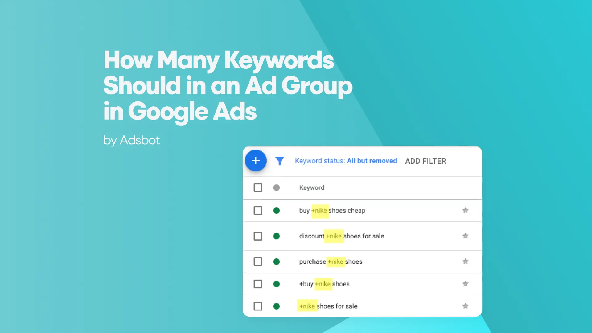
 How Many Keywords Should Be In an Ad Group in Google Ads?
Ever wondered if your Google Ads campaigns are packed with…
Read more -
 Google Ads Script for Dummies: An Introduction
Imagine you have an e-commerce website that sells licensed superhero…
Read more -
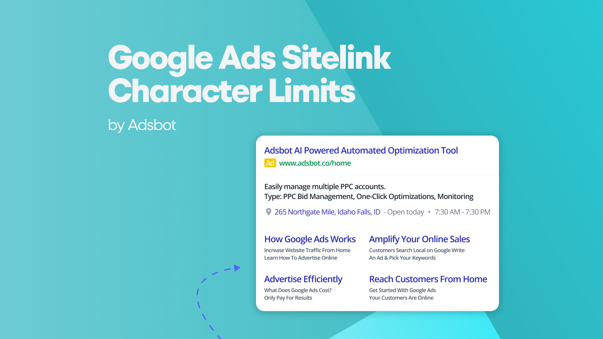
Google Ads Sitelink Character Limits
Your Google Ads are cutting off in the middle of…
Read more -
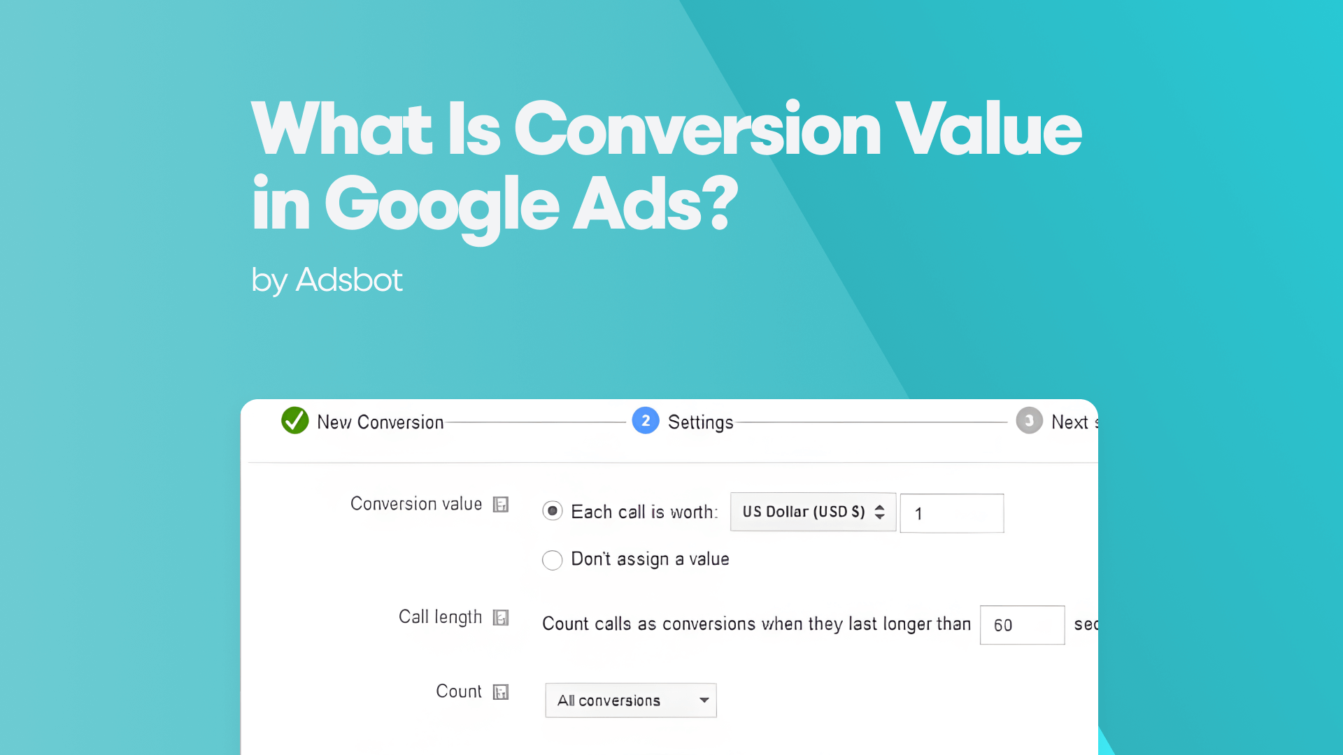
What Is Conversion Value in Google Ads?
What if you could put a price tag on every…
Read more

Register for our Free 14-day Trial now!
No credit card required, cancel anytime.