What are Display ADS exactly?
In digital marketing, Display Ads play a vital role for businesses to connect with their target audience. They help advertisers showcase their products or services to potential customers along their online journey by delivering visually appealing formats across a wide network of websites and platforms. (Youtube, Google etc.)
Display ads, commonly known as banner or image ads, are a form of digital advertising displayed across a broad network of websites. Unlike search ads that appear on search engine results pages, display ads prioritize visual appeal, showcasing images, videos, or interactive elements. They come in various formats and google ads display sizes, including banners, sidebars, and responsive ads that adapt to different screen sizes. Display ads offer advertisers the opportunity to engage their audience with visually compelling content, boosting brand visibility and directing targeted traffic to their website or landing pages. Display ads can be targeted based on factors like demographics, interests, and browsing behavior, allowing advertisers to reach their desired audience with precision.
Google Display ADS Examples
Let’s jump right into the Display ADS Examples. Firstly you’ll see some of the best Google Display Ads examples of recent history. Our first guest is: Shopify!
With this example, we have a strong start. Shopify designed a display ad to explain to users why they should use them with one of their main features. In our Display Ad example, we are faced with a very successful text selection. They will explain to the users exactly what they will get when they click on the ad and they will talk about what kind of advantages they will provide to the users in terms of statistical metrics, which aligns well with their inbound marketing strategy of attracting and converting potential customers.
Key Points for You to Get:
- If you’re working on an example of a display ad that shows your product’s features, give people reasons why you really are a better option than other products that have similar statistical metrics to track.
- Start with a design and content that focuses more on yourself, rather than an approach that attacks or denigrates your competitors. Although Shopify doesn’t use the name of its competitor here you can use just the title of them, it offers us an exemplary display ad example by keeping the design and the basis of the content relevant to itself.
Our second guest is going to be Nike.
It is especially important for companies in areas such as fashion apparel to follow the trend and even set the trend. Therefore, using the word trend and using appropriate visuals allows Nike to present its shoe design to us in a more modern way.
We see a great use of CTA and use of their logo as a trust and validation figure for their customers.
Key Points for You to Get:
- Try to get validation and trust from the customers just like Nike did with the use of their logo and the use of their website’s name.
- Use exciting slogans like ‘’trending now’’ as much as you can to encourage users.
- Understand people’s expectations and needs. In fact you can dictate to them what is trending and why you are the trend and show them exactly what you have to offer in a bold and simple way.
Let’s talk about Spotify’s Display Ad now.
Spotify is known for its Display Ads on Google. In this example, we see the brand’s logo as a trust-builder, with a compelling, music-related and original image, as well as a succinct text. It has an obvious CTA. It highlights a remarkable offer: Listen NOW. This engaging word is emphasized by using it in all areas of the ad.
Key Points for You to Get:
- It’s a good idea to explain your call to action to the user simply and with high density. Show them what they will get thanks to you.
- Feel free to use your logo in your design and use a consistent design language.
It’s time to talk about Disney+
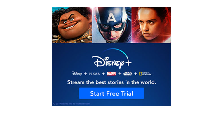
We can often see examples like this from Disney+. They published this Free Trial display ad on Google. We see a display ad featuring Disney’s own colors, adorned with images of well-known characters, brands and a call to action. Simple and right to the point!
Key Points for You to Get:
- When people look at your ad design, they should see elements that make them confident that it’s your display ad. Don’t hesitate to use recognizable images that suit you.
- Pay attention to your design sequence. In this top-down design, we first see the characters that will attract the most attention of the users, then the well-known brands and the call to action button that appears after attracting the user’s attention.
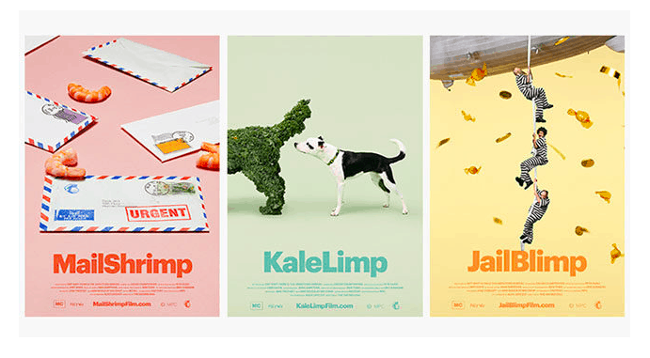
Let’s move on to the humorous part of the display ads with MailChimp.
Mailchimp is a brand that attracts attention with its display ad examples that go beyond serious and classical routine advertising habits. And we see this at the last level with this advertisement. Here’s the key points for you to get from this as humorous an example of a display ad as you could ever possibly find:
- Humor is always an attention-grabbing element. The elements of humor you add to your display ads have the potential to make you stand out among your competitors.
- Being brave and trying to achieve results with display ad designs outside the limits can always be a powerful way. Add humor to your design and text at the level that suits you and experience the results.
Takeaways in General
- Know and identify which users are likely to click your display ad and custom your display ad designs accordingly.
- Try to be as simple as you can without losing context and losing the focus of users.
- Research your competitors and analyze what you can provide the users more than your competitors.
- Analyze your current data and gather obvious metrics for example: the comments, likes etc.
- Be sure that your Display Ad matches the right stage of your funnel.
- Use call to actions and make people feel that you will help them.
- Try to highlight what you are trying to provide for users. They should know what they will see specifically if they click your display ads.
- Have a consistent design language with using your logo, your messages, your trust providers and relevant images that will make people think this is your ad exactly!
- Use A/B testing to see which approach will work best for your display ads.
- Be brave and test users’ capability of taking your brave approach.
Popular Posts
-
How Many Keywords Should Be In an Ad Group in Google Ads?
For the vast majority of modern campaigns, the ideal number…
Read more -
Google Ads Script for Dummies: An Introduction
Imagine you have an e-commerce website that sells licensed superhero…
Read more -
Google Ads Sitelink Character Limits
Your Google Ads are cutting off in the middle of…
Read more -
What Is Conversion Value in Google Ads?
What if you could put a price tag on every…
Read more
Register for our Free 14-day Trial now!
No credit card required, cancel anytime.


