Page speed is an essential factor for any website’s success. It doesn’t matter how great your website looks or how innovative its features are. If it loads slowly, users will quickly lose interest and move on. That’s where a marketing tool comes in handy. A Page Speed Checker tool allows website owners to discover and repair any issues that may be affecting their page performance. It works by checking how fast the page loads and pointing out what might be slowing it down.
1. Importance of page speed for website performance
The importance of a website page speed test cannot be overstated. As previously mentioned, it is a direct ranking factor for Google and can greatly affect user experience and bounce rates. To improve site load time and page speed test, it is essential to utilize tools such as Google PageSpeed Insights and to understand site performance metrics.
Additionally, optimizing server response time, utilizing browser caching, compressing images, and minimizing HTTP requests can all contribute to faster site rendering. It is also important to regularly monitor and maintain landing page performance to sustain improvements. In this case, Adsbot’s Slow Loading URL helps you to check and set alerts for your website speed, contributing not only to SEO performance but also to higher conversion rates and user satisfaction.
2. Adsbot’s Slow Loading URL Tool
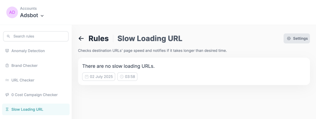
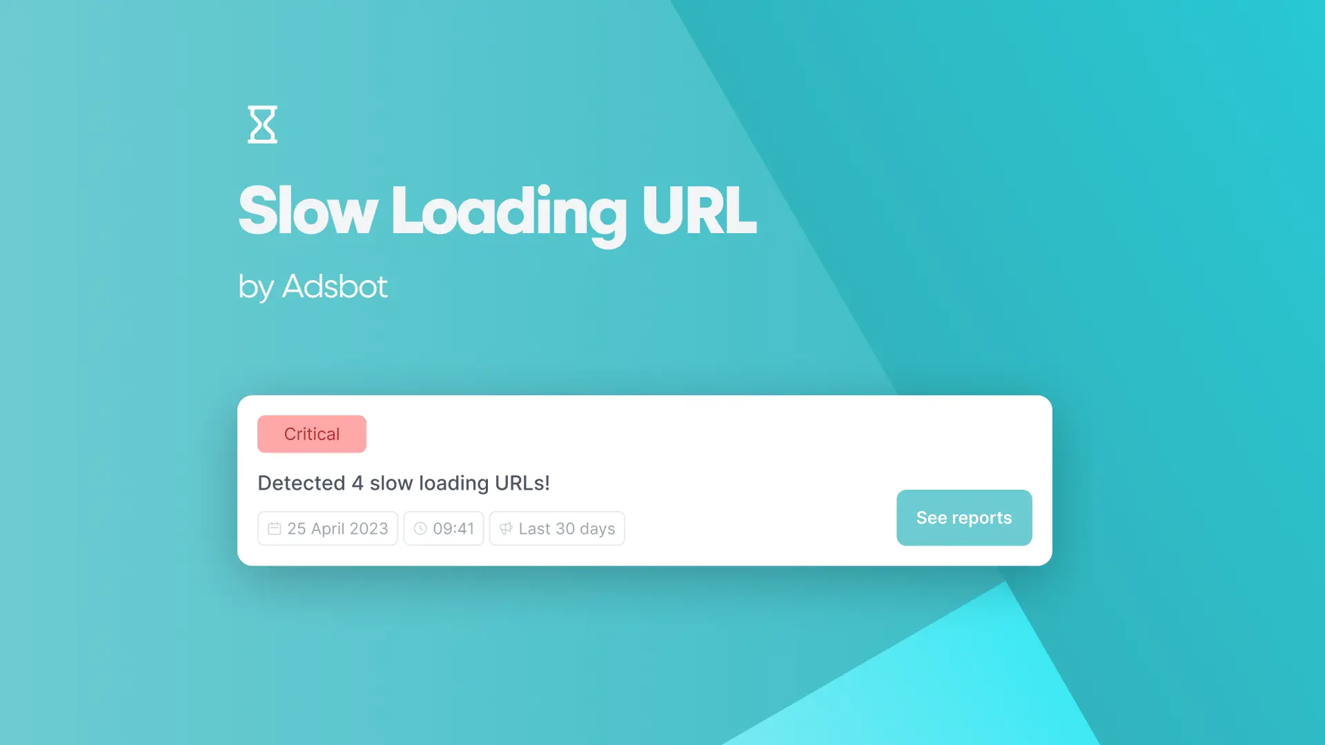
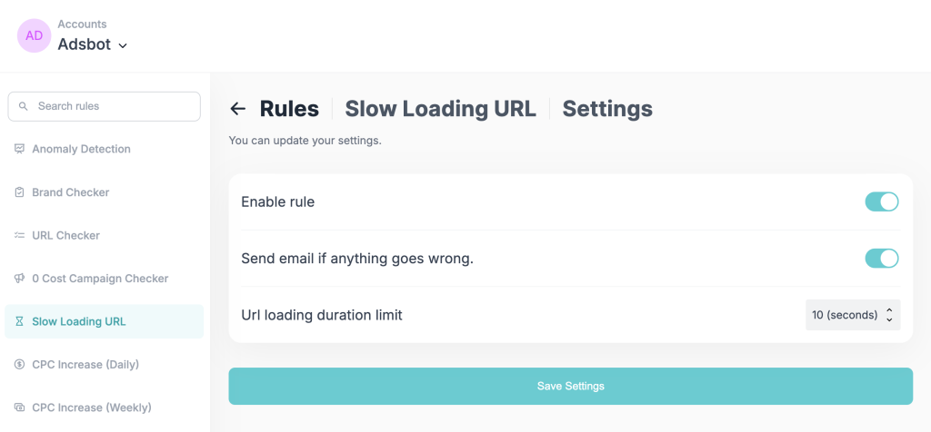
Adsbot’s Slow Loading URL tool stands out as an essential solution for digital marketers and website owners who want to maintain optimal page performance for their Google Ads campaigns. This powerful monitoring tool automatically checks your destination URLs’ page speed and sends instant notifications when loading times exceed your specified threshold. With customizable settings that allow you to set URL loading duration limits, enable automated email alerts, and monitor performance in real-time, Adsbot ensures that your landing pages never compromise your campaign effectiveness due to slow loading speeds.
Adsbot’s seamless integration with Google Ads accounts means you can proactively identify and resolve performance issues before they impact your conversion rates and Quality Scores. By implementing Adsbot’s Slow Loading URL checker into your optimization workflow, you can proactively protect your advertising investment while delivering the fast, seamless experience that converts visitors into customers.
So why wait? Sign up for Adsbot today and start using our page speed checker tool to take your Google Ads campaigns to the next level. With Adsbot, you’ll have everything you need to succeed in the world of digital advertising.
3. Google PageSpeed Insights tool and its features
The PageSpeed Insights tool from Google has been highlighted as a valuable resource for assessing page and website performance. Google Ads page speed analyzes performance on both desktop and mobile devices, measures optimization levels, and makes recommendations for improvement. It is crucial to remember, however, that this tool is not the sole resource required for reliable site speed measurement.
Other metrics such as server response time, browser caching, and image compression should also be taken into consideration for optimal page performance. Adsbot page speed checker tool helps digital marketers to regularly control the webpage speed of their campaign landing pages. With the Adsbot Slow Loading URL tool, you can set alerts to know which landing pages are slow. Also, utilizing Google PageSpeed Insights with website speed testing tools can provide teams with reliable data for increasing user satisfaction.
4. Understanding website performance metrics
Some important metrics to consider include load time, page size, and the number of requests. Optimizing images, reducing HTTP requests, and optimizing code can all improve these metrics and ultimately enhance site performance. Regular monitoring and maintenance of these metrics can help ensure sustained site performance over time. Website owners should check site speed so that they can create a faster, more efficient, and more user-friendly online experience for their visitors.
5. Improving website load time with server response time optimization
One valuable way to improve website load time is to optimize server response time. Upgrading to a more powerful server, reducing TTFB server response times, and utilizing faster web hosting can all help to speed up site performance. Additionally, regularly monitoring server response times can help identify issues and implement necessary changes for sustained site performance.
Other techniques, such as minimizing HTTP requests, compressing images, and optimizing code and scripts, can also contribute to faster page rendering and improved page load times. By utilizing various optimization techniques, website owners can test landing page speed, ensuring a fast and seamless user experience for their site’s visitors.
6. Utilizing browser caching to enhance page speed
Browser caching is a crucial aspect of page speed optimization. By caching frequently requested resources such as images, CSS, and JavaScript files, the browser can load pages more quickly as it does not have to fetch the content every time a user visits the site. Along with reducing server load, this can also enhance the user experience for returning visitors.
Website owners should specify cache headers to decide how long information should be cached to enjoy the full benefits of browser caching. Another efficient technique to employ caching is to use a Content Delivery Network (CDN), which distributes the site’s resources over numerous servers across the world, lowering load time for users from different geographical areas. When combined with other optimization methods such as image compression, limiting HTTP requests, and code optimization, browser caching can result in considerable gains in site speed.
7. Importance of compressing images for faster page rendering
Image compression is an important part of improving page speed and site performance. This is especially significant for web designers and developers who wish to reduce file sizes in order to improve page load speeds. Compressed photos can also improve user experience and site ranking. Consider using WordPress compression plugins to improve your site’s rendering performance.
These tools may dramatically reduce the number of files without sacrificing overall picture quality. Additionally, reducing HTTP requests and streamlining code can improve site speed. By regularly monitoring and maintaining your website, you can ensure sustained and optimized performance.
8. Minimizing HTTP requests for improved performance
Reducing HTTP requests is a tested approach for improving landing page performance. Page speed is an important part of website performance, as explained in earlier sections, and optimizing HTTP requests is an efficient technique to improve it. By reducing the number of requests or making them load faster, website owners can ensure quick loading times and a better user experience. There are several ways to minimize HTTP requests, such as by combining multiple files into one or using sprites.
These strategies can be implemented easily by consulting PageSpeed Insights and the Adsbot Slow Loading URL, which offers suggestions on how to optimize site performance. Adsbot helps you to control slow-loading URLs on your Google Ads account with a page speed checker tool and gives you regular control. Optimizing HTTP requests is not a one-time task, and website owners should regularly monitor and maintain their sites to sustain performance gains.
9. Optimizing code and scripts to speed up website performance
Optimizing code and scripts is an essential step to speeding up site performance. To achieve optimal performance, it’s crucial to understand the impact that poorly written JavaScript code can have on a website. Minimizing HTTP requests by combining and compressing files and scripts can significantly improve load time. Moreover, utilizing server response time optimization techniques and browser caching can give your page an extra performance boost. It’s also important to consider implementing responsive design, as it further improves site speed and enhances the user experience on all devices.
Adsbot’s landing page speed test helps your company find slow-loading URLs and transform them into better performance in favor of your site. Regular monitoring and maintenance of your website can ensure sustained performance and identify any potential issues early on. By following the tips and techniques listed in this article, website owners can significantly improve their page speed and enhance user conversion rates.
10. Benefits of responsive design in improving page speed
When it comes to increasing site performance, responsive design may provide a number of major advantages. This is so that the layout of the website will automatically change to match the user’s device because responsive websites are made to adapt to different screen sizes and device kinds. Load times may be decreased by using the Adsbot page checker to optimize the design for various devices, which enhances the overall user experience. Moreover, the responsive design eliminates the need for several websites for various devices, saving time and labor while also lowering the number of HTTP requests required, which can further accelerate page load times. Increases in website speed and user happiness may be achieved by combining responsive design with additional strategies like script and code optimization and image compression.
11. Regular monitoring and maintenance for sustained website performance
Regular monitoring and maintenance tasks are among the most important elements of maintaining website functionality. This includes optimizing code and scripts, optimizing images, reducing HTTP requests, and testing site performance. At this point, it is also important that the site is responsive and mobile-friendly so that it does not adversely affect page performance. You can check mobile-friendliness with the mobile speed score Google Ads. Of course, especially with the use of tools like Adsbot, brands can automate their monitoring and maintenance tasks using a variety of tools and technologies to maintain the functionality of their websites. Thus, areas of improvement can be easily discovered and maintenance operations can be routinely monitored, and necessary actions can be taken to ensure optimum website performance. This not only improves user experience but also aids in raising search engine ranks, which boosts traffic and produces better company results.
It’s crucial to make a website that people can explore quickly and easily while building one. Because of this, website owners may greatly benefit from doing assessments. There are several programs that may examine a site’s performance and offer recommendations for improvement, including PageSpeed Insights and the Adsbot webpage speed checker for slow-loading URLs. These tools provide rankings based on variables like mobile friendliness and page load speed, which can assist website owners in speeding up their sites across all platforms. By running regular tests, website owners can ensure that their pages remain fast and user-friendly, making for a better overall online experience.
Author:

Get 3x more revenue from the same ad spend.
Let our onboarding experts show you the power of AI-driven PPC optimization.
Start scaling today
Popular Posts
-
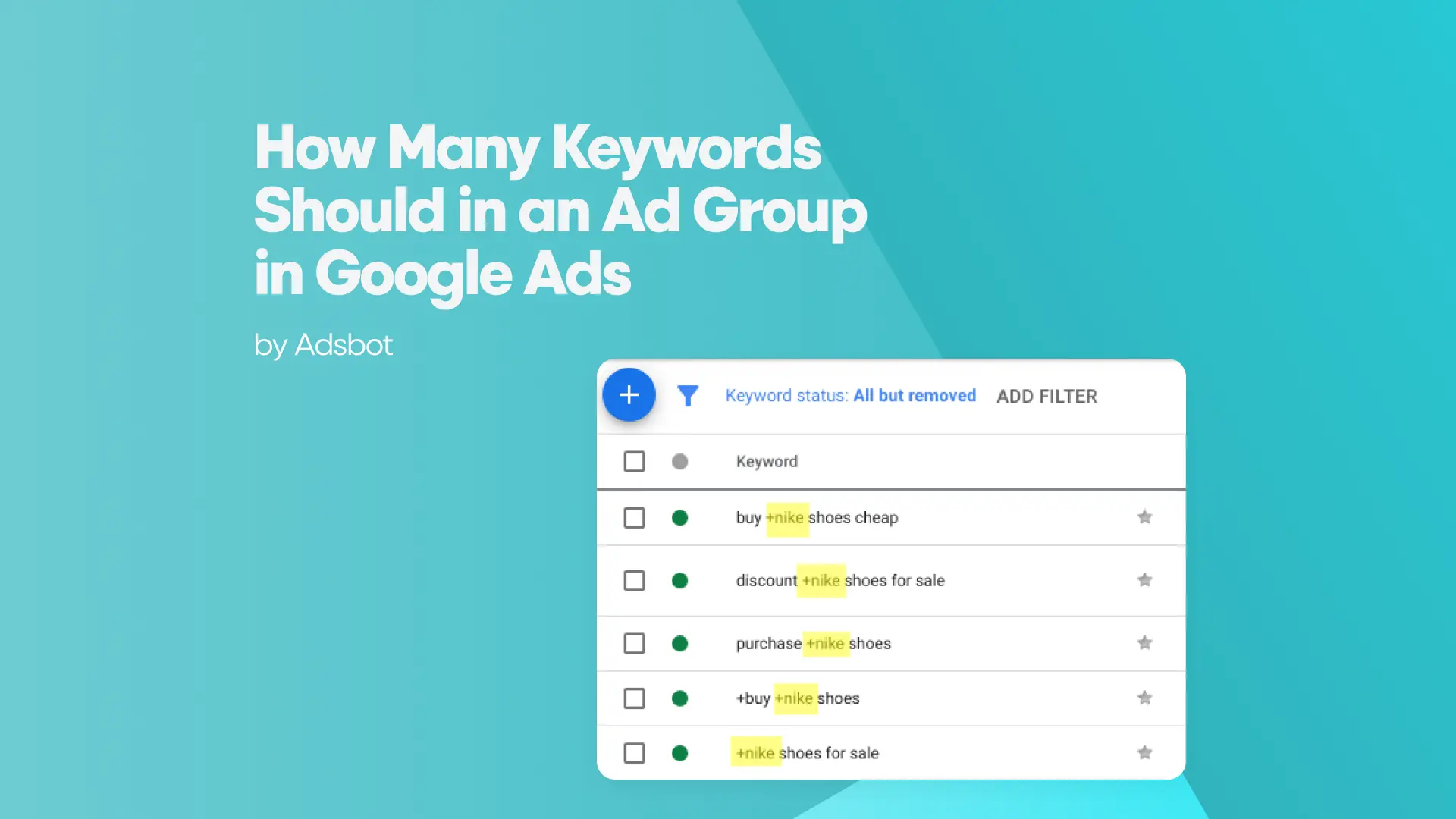
 How Many Keywords Should Be In an Ad Group in Google Ads?
For the vast majority of modern campaigns, the ideal number…
Read more -
 Google Ads Script for Dummies: An Introduction
Imagine you have an e-commerce website that sells licensed superhero…
Read more -
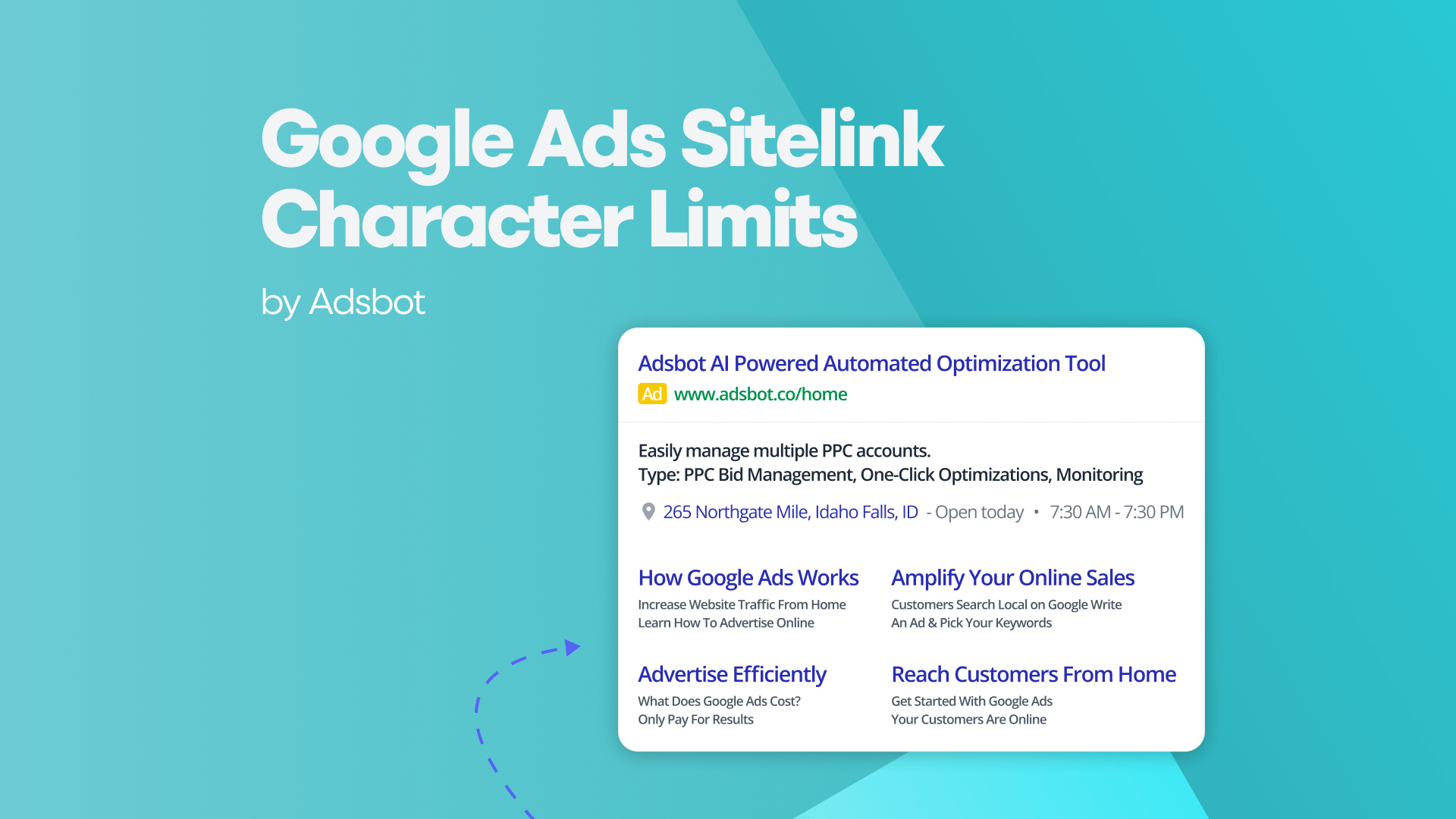
Google Ads Sitelink Character Limits
Your Google Ads are cutting off in the middle of…
Read more -
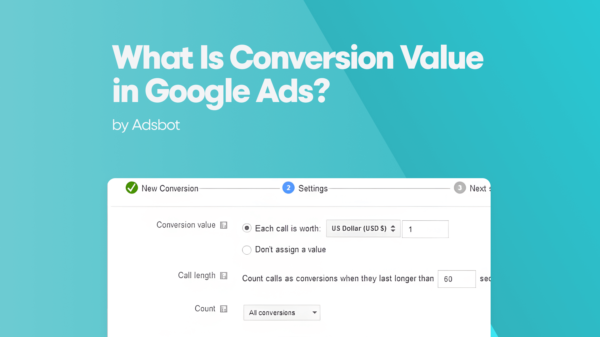
What Is Conversion Value in Google Ads?
What if you could put a price tag on every…
Read more

Register for our Free 14-day Trial now!
No credit card required, cancel anytime.